Analytics2 min read

Excel to Infographic: Turn Spreadsheet Data into Visual Stories with AI

Edithly reads your Excel data, finds the story in it, and designs a shareable infographic automatically — no chart-building or design skills needed.

EEdithly Team
Excel to Infographic: Turn Spreadsheet Data into Visual Stories with AI

Direct answer: Upload your Excel file to Edithly and get a designed infographic in seconds — the AI picks the right chart types and highlights the story in your data automatically.

Why Spreadsheets Aren't Enough

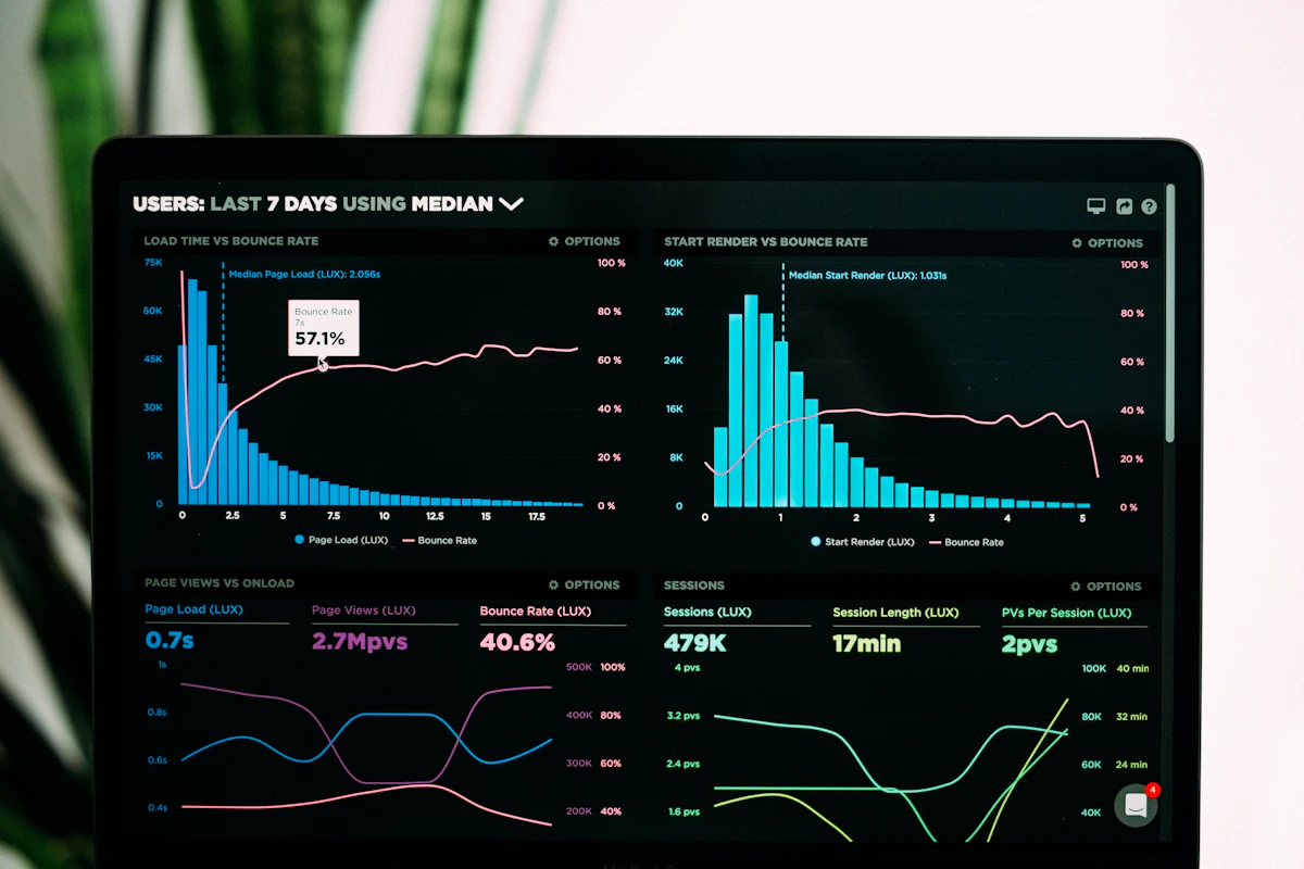
A spreadsheet full of numbers communicates almost nothing to someone who hasn't spent time analyzing it. An infographic does the interpretation for the reader — it highlights the comparison, trend, or outlier that actually matters.

How Edithly Builds the Infographic

  1. Reads your data — Edithly parses rows, columns, and headers to understand what each figure represents.
  2. Finds the narrative — the AI identifies the most significant trends, comparisons, or outliers in the dataset.
  3. Chooses the right visual — bar charts for comparisons, line charts for trends over time, pie charts for proportions, and so on.
  4. Designs the layout — a clean, professional infographic layout is generated automatically, ready to export.

Common Use Cases

  • Sales and marketing teams turning quarterly performance data into a one-page visual for stakeholders.
  • Analysts converting survey results into a shareable summary graphic.
  • Founders presenting traction metrics to investors without building custom charts in a design tool.
  • Educators visualizing classroom or research data for presentations.

Excel to Infographic vs. Excel to Presentation

If you need a full multi-slide deck rather than a single visual, use Excel to Presentation instead — it builds a complete slide deck with narrative insights alongside your charts. For a written, data-backed report, see Excel to Report.

Try It Now

Upload any .xlsx, .xls, or .csv file to Edithly's Excel to Infographic tool and get your first infographic free.

Frequently Asked Questions

What kind of Excel data works best for infographics?

Numeric data with clear labels — sales figures, survey results, performance metrics, and financial summaries — produces the richest infographics. Clean column headers help the AI understand what each figure represents.

Does Edithly choose the chart types automatically?

Yes. Edithly analyzes your data and automatically selects appropriate visualizations — bar, line, pie, comparison, or timeline — based on what best represents the underlying trend.

Can I use my own brand colors?

Yes, after generation you can customize colors, fonts, and layout inside Edithly to match your brand guidelines.

Can I combine multiple sheets into one infographic?

Yes, you can select data from multiple sheets in the same workbook and Edithly will merge them into one cohesive visual story.

What format can I export the infographic in?

PNG, PDF, or SVG — export at print resolution or web-optimized size for sharing on social platforms.

Try Edithly free

Turn any document into something useful

Upload a PDF, paste a URL, or drop a YouTube link. Get mind maps, flashcards, MCQs, presentations and more — in seconds.